Sep
2012
28
My Newest Logo & Site Design Project launched!
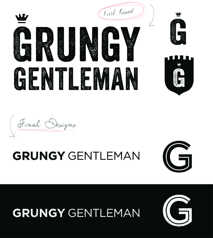
My logo & branding concepts:
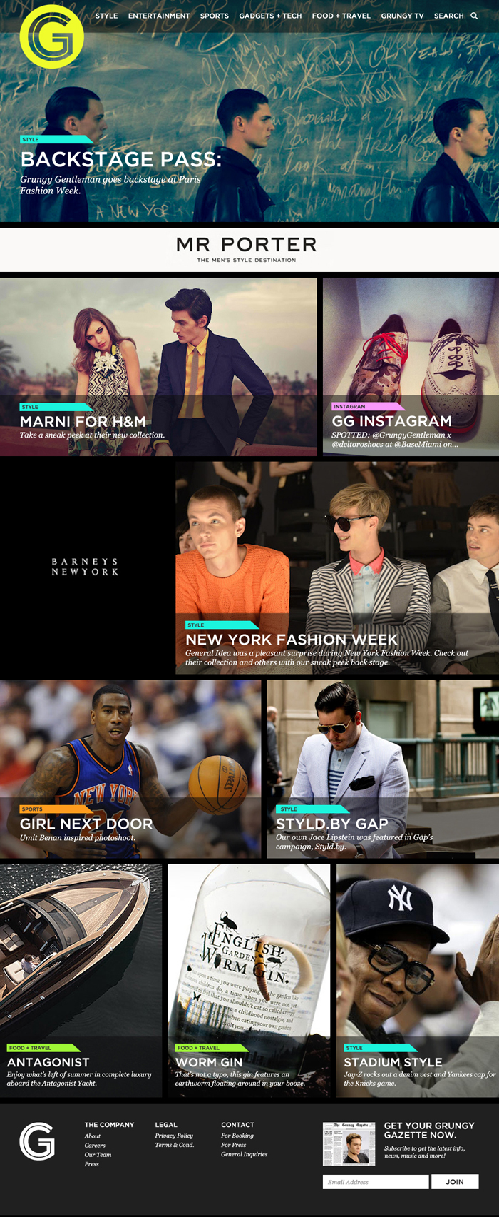
… and my website design.
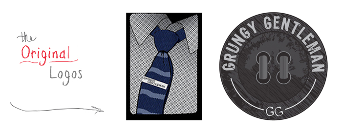
Here are the original logos the site initially had:
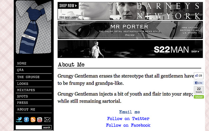
This is the original blog design with a pink plaid background and distressed font choices….
I work for doejo, a creative web & print agency, and I recently was given a short deadline project for a publication called, Grungy Gentleman. The project was an overhaul of the branding and design of the site, which at the time, was just a blog. My job was to help it grow-up into a polished, men’s publication.


1 Comment
Add a CommentMichaela | August 20, 2014
Hey There. I discovered your weblog the use of msn. That is an extremely
well written article. I will make sure to bookmark it and
come back to read more of your useful info. Thanks for the post.
I’ll definitely comeback.