Category: My Work

  • pills around text that says "A taste of your own medicine: why you should start taking your own advice."If you’re anything like me, you’re REALLY great at giving advice. Providing guidance on someone else’s dating life, or how they should just “take the plunge” with a freelance career, or get started on writing that book is so easy — everything is just so damn obvious and clear. The truth is, we’re all pretty good at seeing things clearly from the sidelines and have the best intentions for our friends, colleagues and acquaintances, and yet most of us seem to fail at taking our own advice.


    What I do for a living is provide advice, guidance and strategy for other people’s businesses. I help them find their audiences, define their niche and strategize the best way to connect their company’s vision with their customers’ needs. I put my blood, sweat and tears into helping others get their shit together, and yet I’ve rarely stopped to use my methods on my OWN business… until I had a bit of an awakening a week ago.


    I finally sat down and looked at my consulting business, which is really hard to do when your brand is primarily just YOU. It’s hard to be IN something and not just a consultant on the outside looking in. I do great work for others. I am incredibly thoughtful, user-centric and attention to detail… yet I struggled to define what my brand IS, what value I actually bring to the table, and align that with what it is I LOVE doing. I’ve inadvertently spent my week in my clients’ shoes, becoming incredibly empathetic to their struggles.


    After fielding countless emails for new client work, I found out a lot about what I DON’T like doing — which I believe is the key to finding yourself AND your brand. I’ve found over the years that I get frustrated when people hire me for just “design work”, when I do so much more than that. “WHY would they think I’m just a designer?” I think, HOW IS IT NOT CLEAR? Then I took a step back. I’ve never defined my own damn niche. My web presence doesn’t reflect the strategy, my focus on brand personalities or ideals that I instill in the design work I showcase. I’ve never really sorted out what I DO do and what I DON’T do because, let’s face it, sometimes you do things you don’t love in order to pay the bills and keep Sallie Mae from hunting you down and cutting off a limb. Well, I’ve decided that I don’t want to do that anymore, just like I don’t want to “dress like a professional”or look forward to “casual Fridays” for any of my future jobs. As the great Matthew McConaughey said — YES, I’m referencing a quote from Matthew McConaughey, is that a problem? Haha :)


    The first step that leads to our identity in life is usually not ‘I know who I am,’ but rather ‘I know who I am not.’ — Matthew McConaughey


    Pretty damn good, right? So here’s what I’m not, I’m not a person who is: manipulative, self-helpy, egotistical, a health nut, lazy, money hungry (maybe a little, but again, Sallie Mae is a ruthless bitch), phony or insincere and I’m not one who posts countless selfies for validation (but hey, I understand if that’s YOUR JAM — you do you). On the services side of what I don’t care to do: heavy web development, tons of illustrations or icons, banner ads, heavy analytic analysis, designing incredibly complex dashboards, and I don’t just make things “look pretty” — I make them functional and for their intended audiences, and yes, in turn they come out pretty damn gorgeous (I’m not egotistical, I’m just tired of being self-deprecating about my work).


    Based on that, I’ve come to realize that I am a person who is: caring, helpful, motivated, passionate, an essentialist, thoughtful, empathetic, creative, straight-forward, hands-on, hardworking and someone who really just wants to spend her days living in a cabin in the woods with her rescue dog, Margot, drinking whiskey, building furniture while listening to Die Antwoord and pretending she’s Yolandi Visser (hey, I didn’t say I wasn’t a little weird). On the services side of what I LOVE and am good at doing is helping businesses: conduct user & market research, identify and understand their audience, find their unique value adds, create engagement methods, create marketing strategies, roadmap their brand strategy, define their brand’s personality and voice, create guides & toolkits, define priorities, and then take all that information to help guide the design of products, print collateral and environmental design. In summation: I genuinely love helping businesses find their audiences, define their niche and strategize the best way to connect their company’s vision with their customers’ needs. It’s all about aligning the company’s passion with THEIR “right” people and then helping them visualize it.


    So now I’m finally taking my own advice in my quest to define my personal brand and business. It has not only helped me with how I approach opportunities, but also the types of clients and projects that I want to attract. We’re naturally drawn to people who are like us, it’s just a fact that we’re all just a bunch of narcissists. But in all seriousness: clients who can identify or respect those qualities in me are going to enjoy our process together. We’ll have some common ground and, hey, that’s not a bad place to start.

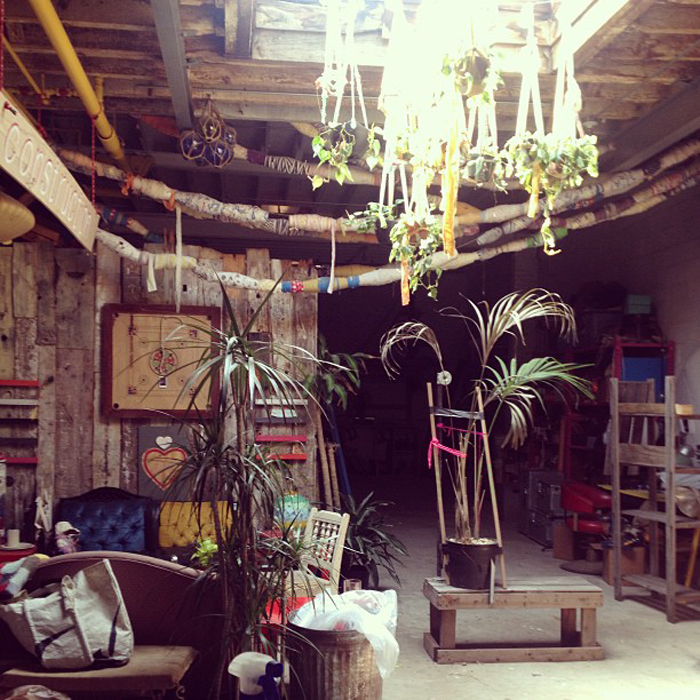
  • Today is not only my ONE YEAR anniversary here in NYC, but my first day working with the ladies of Domestic Construction. I am officially building, making and crafting things for these incredible girls.

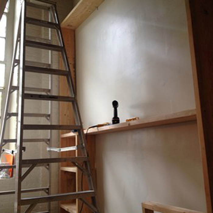
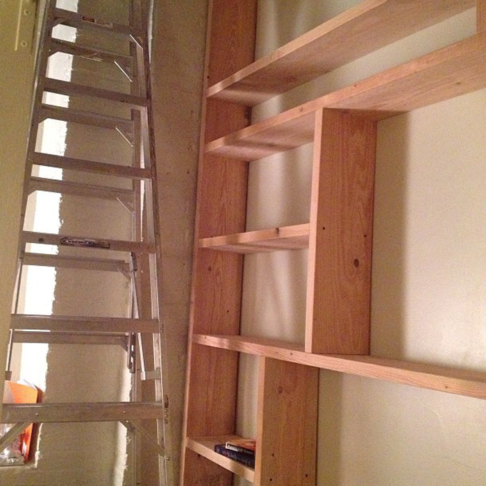
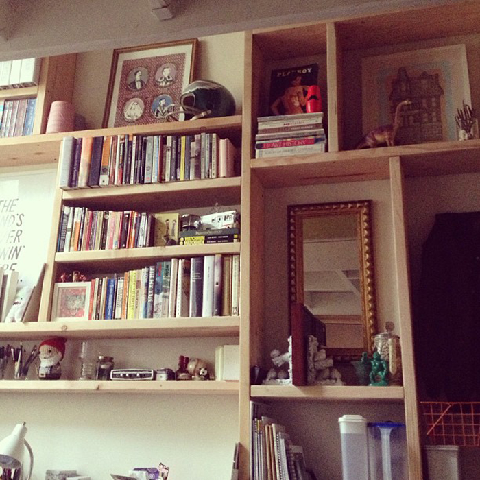
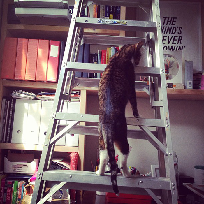
  • I moved into a larger room in our loft and decided to totally renovate it, like I said: I LOVE BUILDING THINGS. Anyway, here’s my well-planned, 10ft bookshelf I built with my boyfriend over the weekend… and our cat, Bubs, exploring things while I was working on organizing. I’m hoping to get the room photographed, so I can show all the before and afters.


  • May
    2013

    27

    Salvage Desk Project

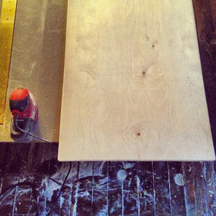
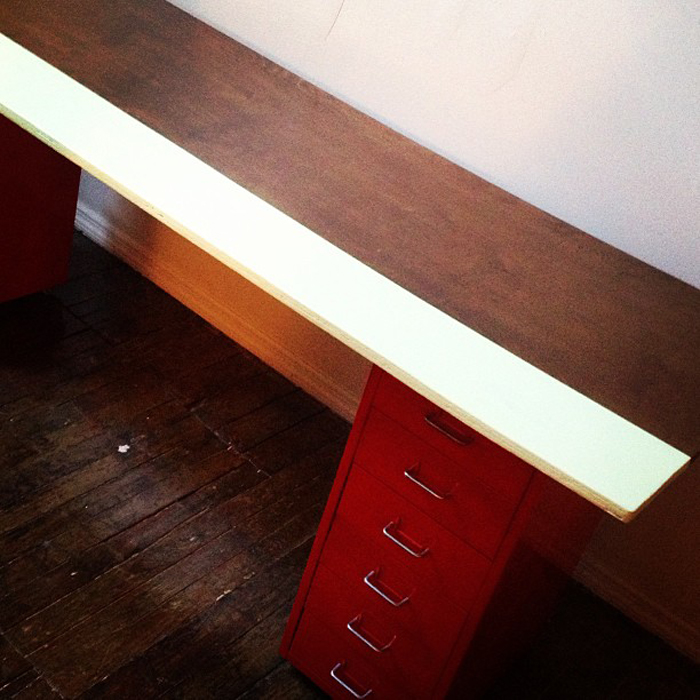
    So I grew up refinishing furniture and houses, and I have never been able to shake the itch I have to build stuff… so I built a desk today. I had a make-shift plywood desk in our old room and I decided I would take it apart, refinish the top piece and IKEA hack it onto my red metal drawers. Sorry for the grainy images, will post better ones soon!

  •  


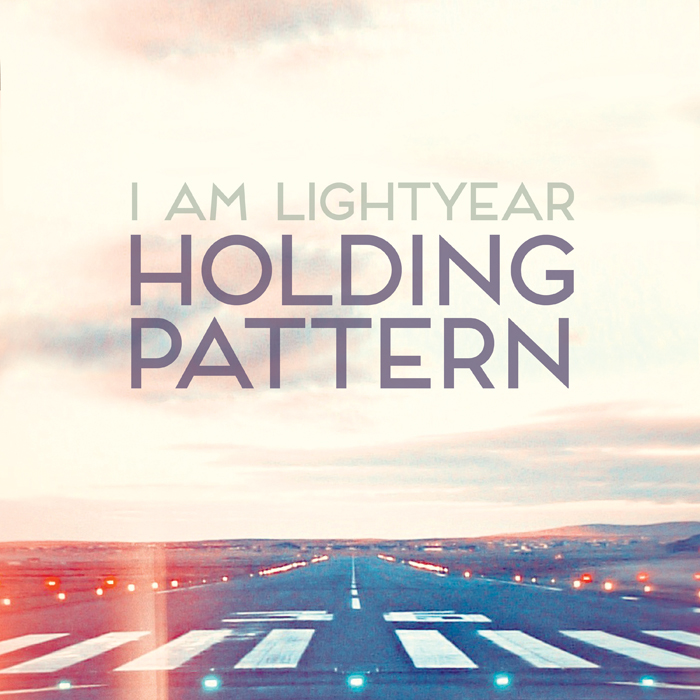
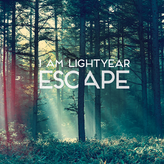
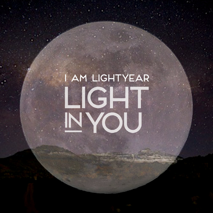
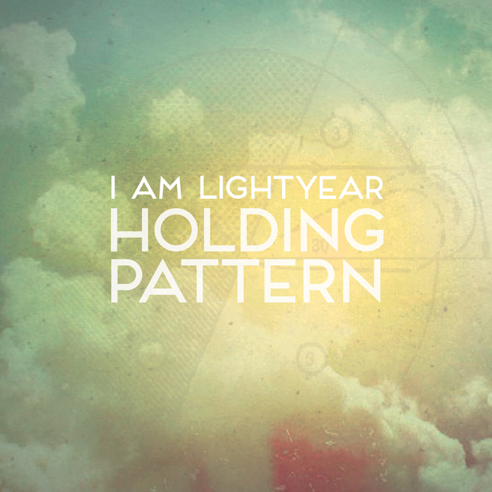
    I created a bunch of song artwork for I Am Lightyear’s new EP, Holding Pattern. Check out her work, she’s a pretty amazing lady.

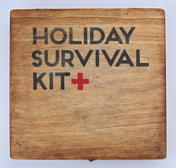
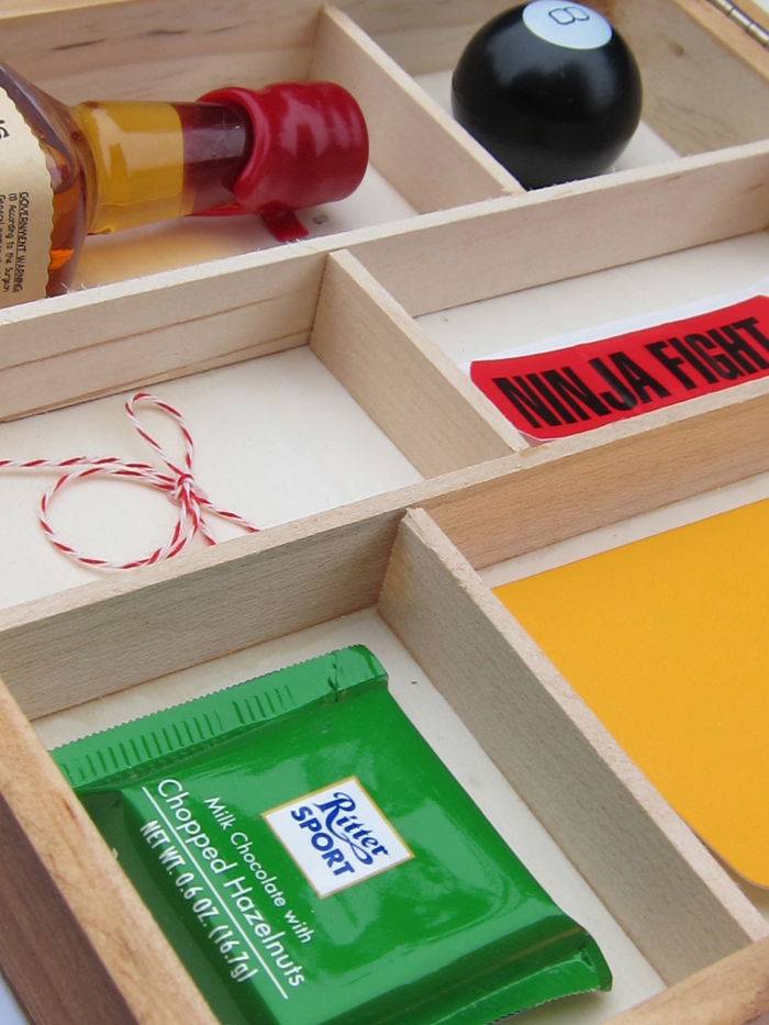
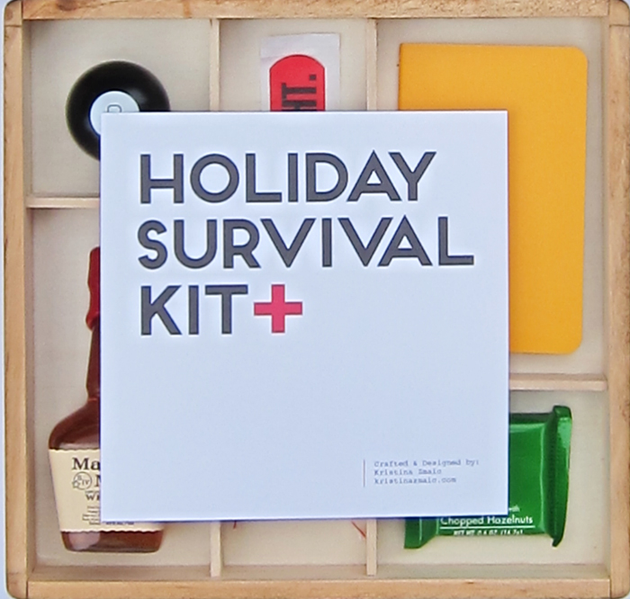
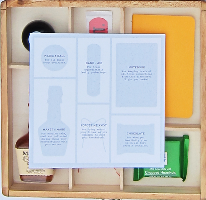
  • I worked really hard to create these Holiday Survival Kits for some holiday gifts this year. I think they’re finally ready to get wrapped up and shipped! It took me awhile to miter cut each “frame”, stain and screen each box and put everything perfectly in place. I love them and am so excited to send them out into the world.

  • Nov
    2012

    15

    Tea Packaging

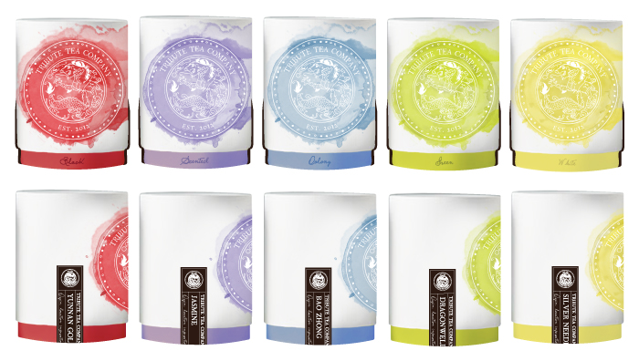
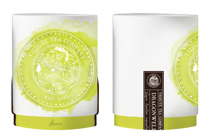
    My initial mock-ups for Tribute Tea’s packaging (above) and first-round samples (below).


    I finally got my first-round samples of Tribute Tea’s packaging from the manufacturer and, although not perfect, they’re pretty great for first-rounds. I’m really excited to see these coming together and can’t wait to see them on shelves.


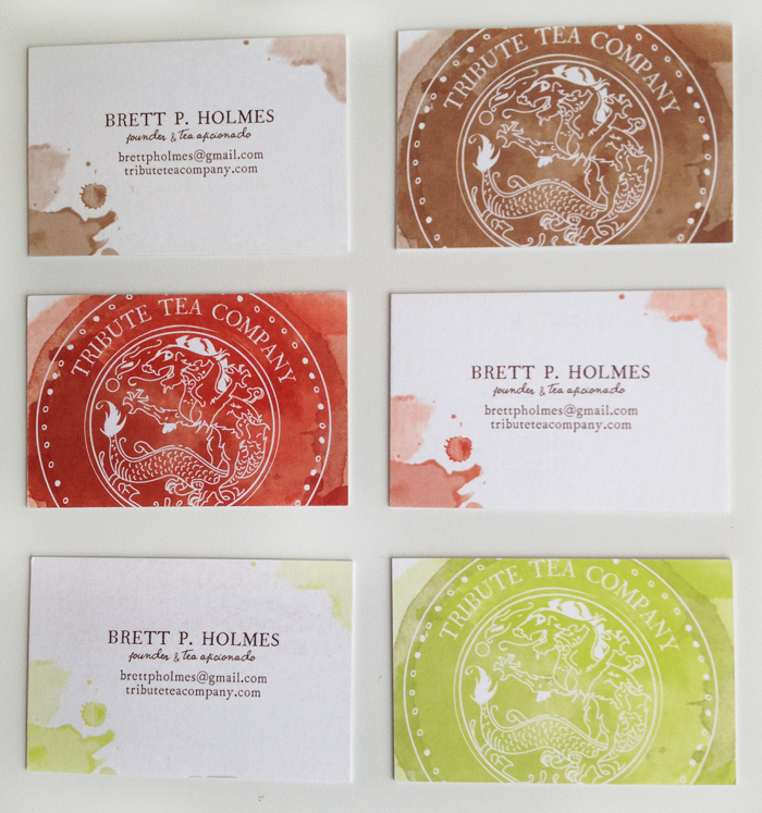
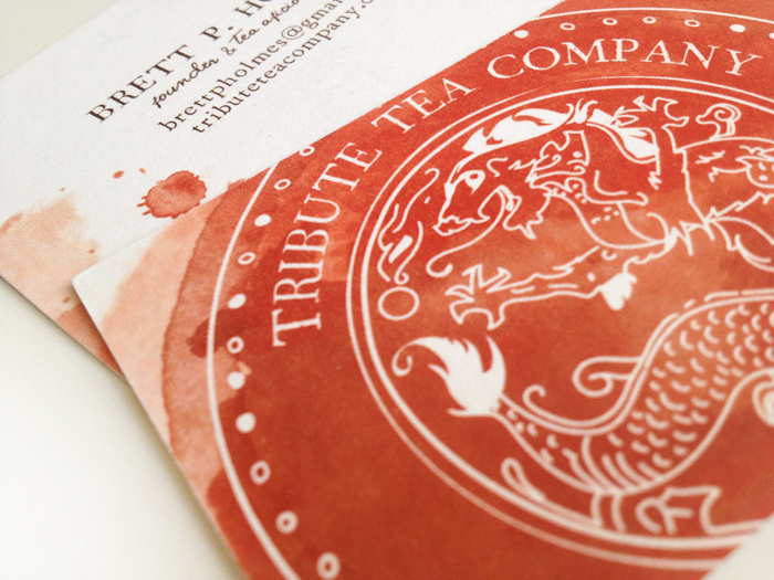
  • Logo and business cards I designed for my client, Tribute Tea. I wanted to do something really organic and the idea of utilizing a tea stain came in mind. I love the way they came out!


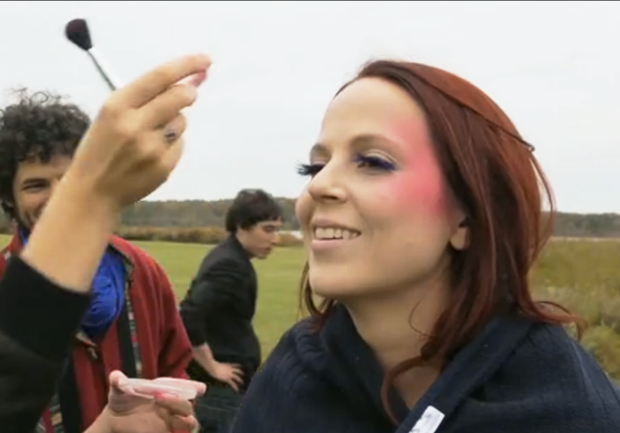
  • So during the epic Hurricane Sandy, I was down in North Carolina doing hair and makeup for the lovely, Lauren Zettler of I am Lightyear. We spent the weekend running through the forrest, lighting colored smoke bombs and sprinting in circles with sparklers. It was a really good time with some really great people. Last night the actual video for “Lose Myself”premiered at the Converse Rubber Tracks studio. So take a look at the trailer and see me in action.


    Video directed by Habib Yazdi.

    Behind the scenes video filmed and edited by Kristen Winter.

  • Nov
    2012

    6

    Acupuncture Site

    My good friend, Jen, was starting her own acupuncture practice and needed a classy site, so we did a bit of bartering and this beaut resulted. It’s a simple one-page, parallax site that really has a tranquil feel. Clean and simple, my favorite. See it live in action.

  • My logo & branding concepts:


    … and my website design.


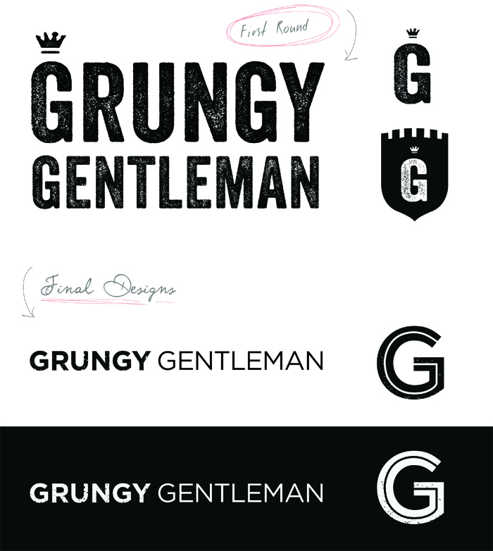
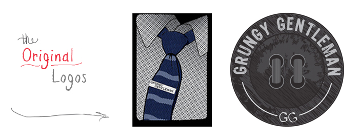
    Here are the original logos the site initially had:


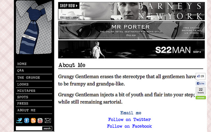
    This is the original blog design with a pink plaid background and distressed font choices….


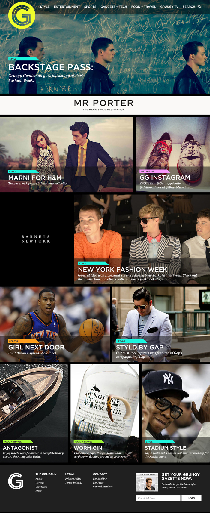
    I work for doejo, a creative web & print agency, and I recently was given a short deadline project for a publication called, Grungy Gentleman.  The project was an overhaul of the branding and design of the site, which at the time, was just a blog. My job was to help it grow-up into a polished, men’s publication.

  • So, in the dead of winter last year I helped my good friend, Gus, with the makeup for a music video he was doing for Nathan Xandar. It was a freezing day in some small town with a lot of great people. Here’s a result of all our hard work.


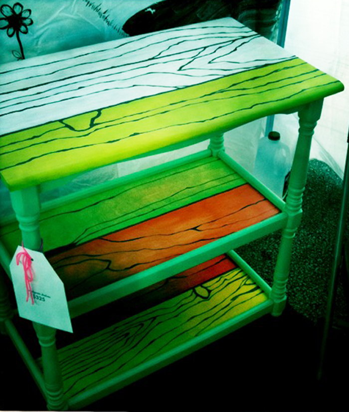
  • So, what began as a gift for my downstairs flat-mate for all the delicious pulled pork he made for me over the years ended up as this hand-painted woodgrain shelf I made to sell at Renegade Craft Fair in Chicago. This was an old department store, cheap looking “woodblock” topped kitchen island/table that I found in an alley one day, then left outside on my deck for two winters, until I finally got the motivation to transform it. I’ve been obsessed with woodgrain for decades as well as Roy Lichtenstein, so this is what came of that. I custom cut each of the shelves from quater inch ply and hand painted each piece. This is a few years old, and I only have crappy iPhone photos of it, but I stumbled upon it today and thought it should be shared!
  • Here is some lettering I did for a shirt design for Family Records. They should be out soon…

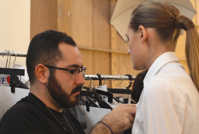
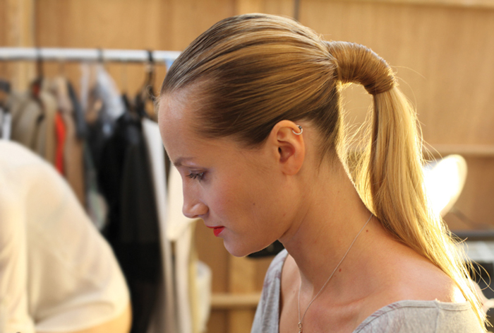
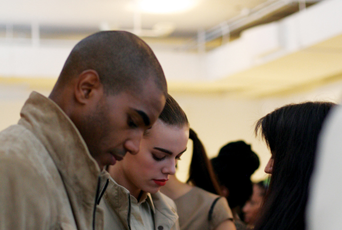
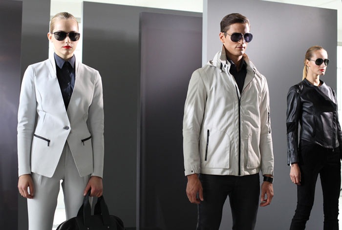
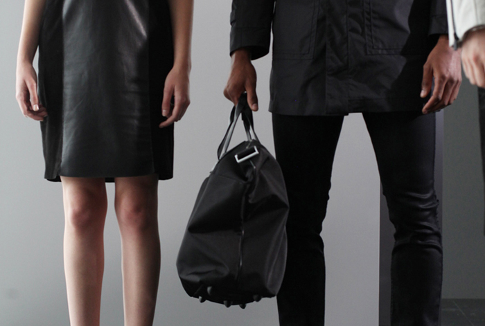
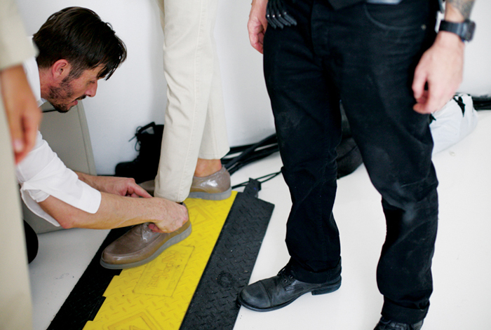
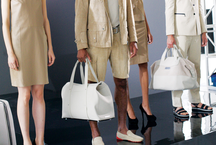
  • Some backstage shots I took of Porsche Design Spring 2013.


    So this was my first show EVER for Spring 2013 New York Fashion Week. This was an exclusive showing of Porsche Design’s collection.

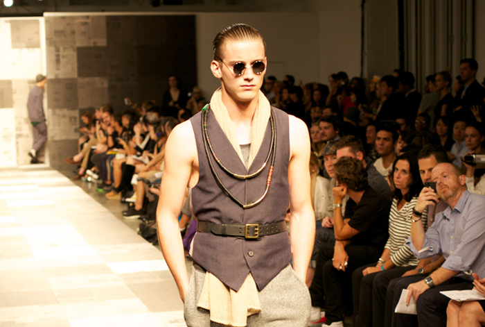
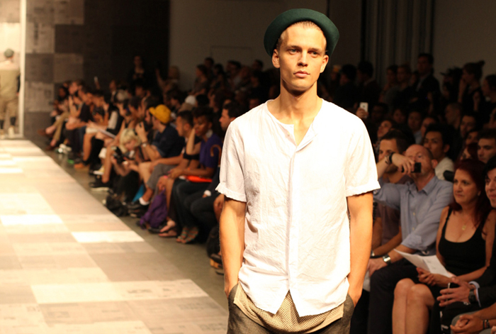
  • More of my New York Fashion Week shots, this round are some of my faves (out of literally hundreds of photos I shot). This show was Robert Geller’s collection for Spring 2013.

  •  

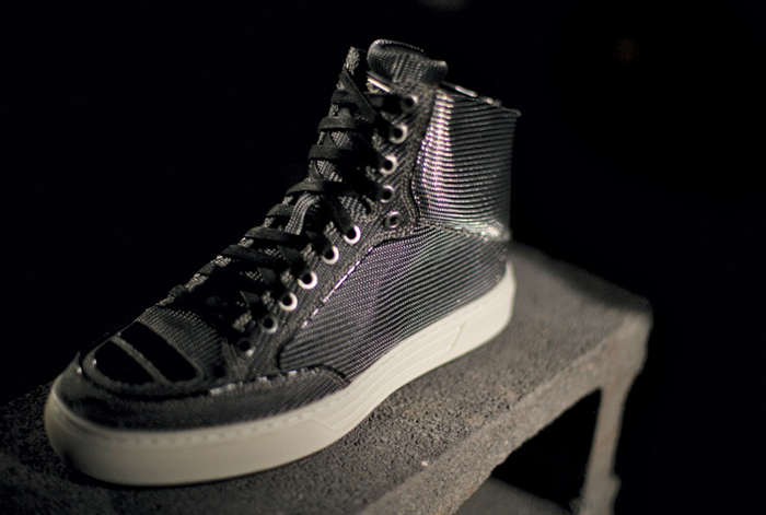
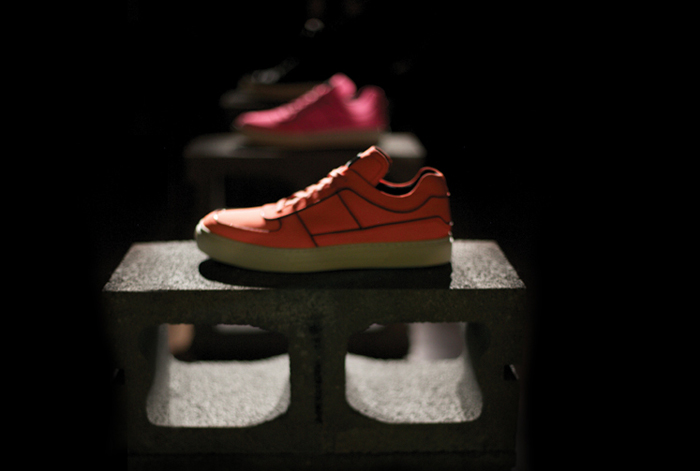
    I was lucky enough to get to photograph New York Fashion Week my first few months here in New York. Here is my photography debut with Alejandro Ingelmo’s shoes.


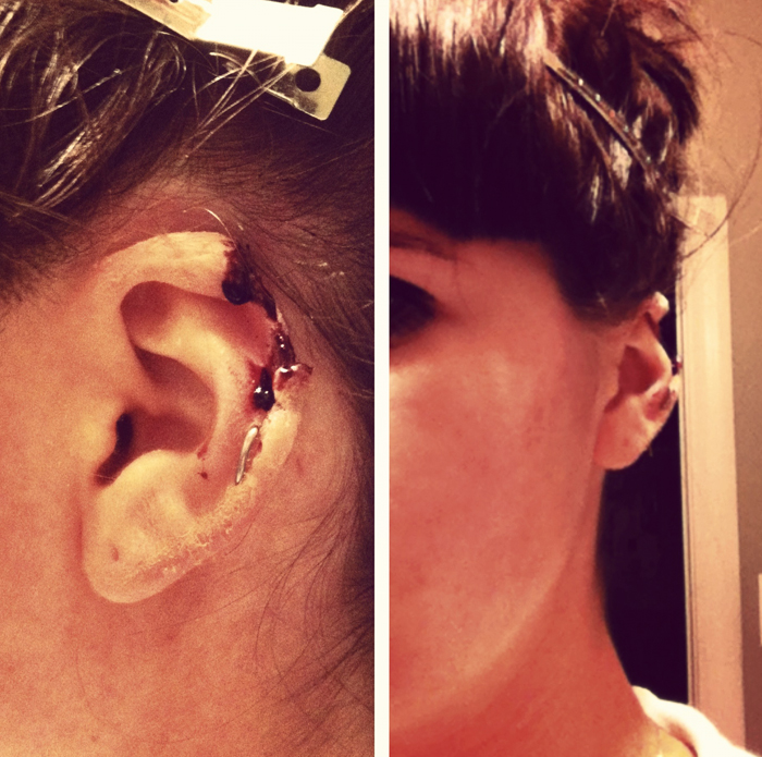
  • Some bitten off ear, special effect test makeup I did for a commercial involving a stuffed animal biting someone’s ear off…

  •  

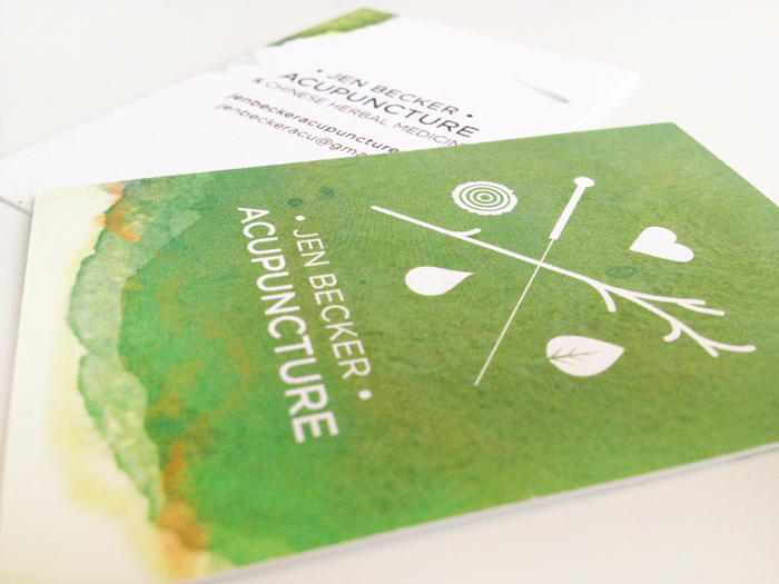
    My good friend, Jen, came to me to create her logo and business cards for her private acupuncture practice. With a little bartering and a lot of work, this is what resulted…

  • So, this week I began working at Studiomates, quite possibly the most inspiring place in Brooklyn. I currently work for Doejo, a print and web design firm out of Chicago and when I came to New York to help expand the New York branch there was no other co-op space that could compare…


    Studiomates is run by the one-and-only Tina Roth Eisenberg (aka Swiss-Miss) and is filled with designers, illustrators, bloggers, writers, developers and everyone else in between! There are nothing but inspiring and INCREDIBLY talented people here and I am honored to be amongst some of the best!